
This is featured content.
This is a verse block.
In the last week or so since taking over the reins of Themes Product Ambassador-ship, I’ve been mulling over the best place to start with testing, giving feedback, and generally getting involved helping to make our theme experience the best it can possibly be for our users.
After a little (panic-induced) hesitation, Mo suggested an idea that made a lot of sense: think small.
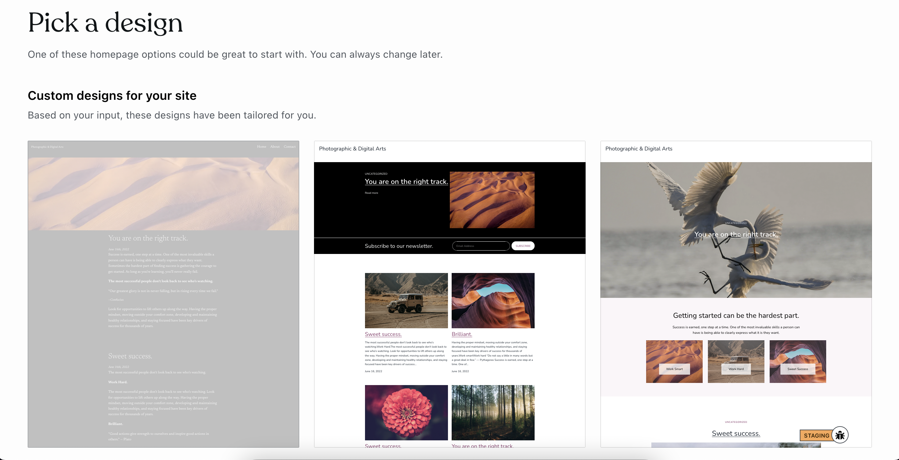
For many new users, trying to pick the right theme for their site or blog can be a daunting task. What layout works best for them? What features do they need? What showcases their content best?
While they’re looking at our theme gallery trying to answer these questions, we should be asking questions of our own. How does the process feel for our users? How can we make it as stress-free and straightforward as possible? Is there any part of the theme flow that’s not instinctual, or doesn’t make sense?
With all of this in mind, I set out to do some testing in a couple of stages. First by trying to put myself in the mind of a new user applying a theme for the first time, picking out smaller details from our new user process to see if there’s anything we can improve upon.
The second stage was to enlist the help of a genuine, real-life new user who had never come anywhere near WordPress.com before. A couple of friends tried to create their own new sites, and had some feedback of their own.
I’ll aim to share my feedback in a series of posts here. The first one goes into detail about my findings, the second will be the feedback of real-life new users, and the third will wrap everything up.
Here’s what we found!
Creating a new site and applying a theme
- Themes grey out like something is meant to happen or overlay, but it doesn’t. Add a ‘Click to Preview’ overlay
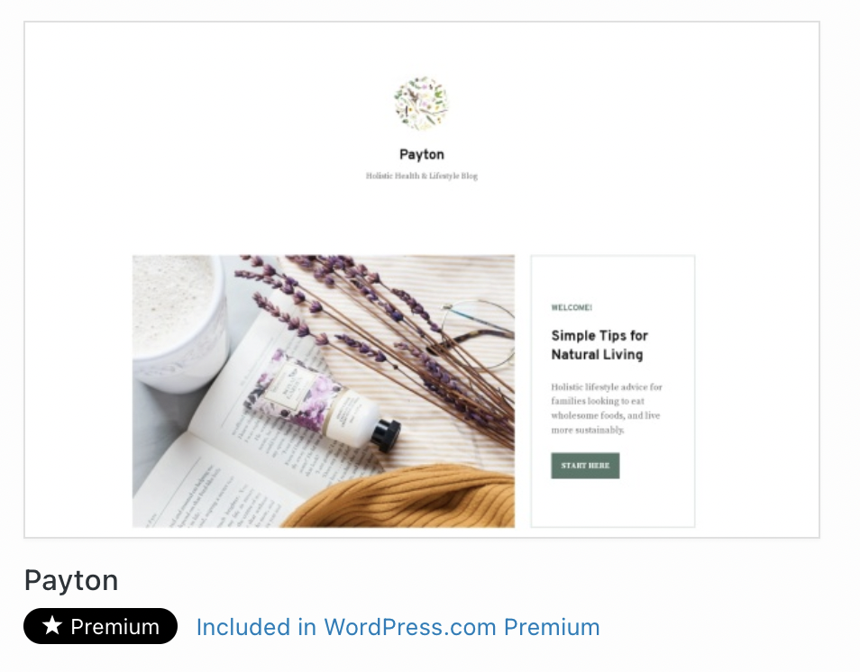
- Premium themes ‘Included in WordPress.com Premium’… what does this mean? Specify that this is the Premium plan, a new user may not have any idea what the Premium plan is at this point.
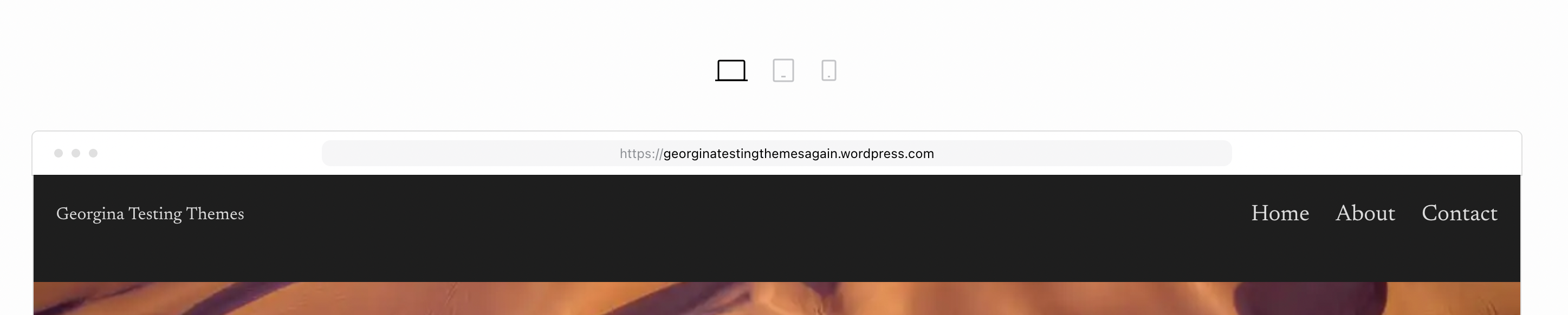
- Label the screen sizes – Desktop, Tablet, Phone. We’re assuming knowledge the user may not have. To a new user, these might be just various-sized boxes
- ’Continue’ button could be bigger and… fun-er? There’s a lot of white space here in general, and it makes the experience feel kinda empty.

- Clicking this button takes me to the post editor, but there’s no instruction from here. It would be great to have some speech bubbles here to indicate where we are, what tools we have, and what we can do from here. We’re really throwing people in at the deep end!
Switching the theme on your existing site

You must be logged in to post a comment.